First Impressions Matter
For many users, their first few minutes in Breakroom are their first experience with a 3D virtual world. That’s why we’ve gone back to basics, and started cleaning things up.
This update is the first part of a larger project aimed at creating a simpler, more intuitive experience for first-time users. The focus? Reducing clutter, improving clarity, and making sure new users can learn the platform naturally without being overwhelmed.
What’s Changing?
This is not a redesign. It’s a focused clean-up of the default user interface, designed to help users get started without unnecessary distractions.
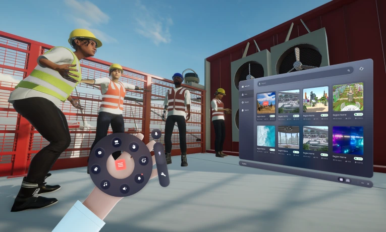
Here’s what’s improved in this first pass:
- Lean interface: Only key panels are visible by default. Everything else has been tucked away under the taskbar menu. Users can pin what they need as they get more familiar with the platform. Grid admins still control what features are available. For example, if the Mini Map is enabled, users can choose to pin or unpin it.
- Intuitive system alert: Messages and invites now appear in a cleaner layout, with red-dot indicators only where they add real value.
- Real time tooltip: Hovering over each icon now shows clearer, more helpful labels — especially for users new to virtual world platforms.
- Small Device Optimisation: The interface now scales better for lower-resolution displays without breaking layout or hiding important tools.
- Smart error management: If a user has connection or voice issues, they’ll now see plain-language toast messages explaining what’s happening and what to do.
Why This Matters
Virtual training platforms often welcome users who are unfamiliar with 3D environments. The more cluttered or confusing the interface, the more likely they are to get stuck.
This update is about removing unnecessary friction. By decluttering the interface and improving onboarding clarity, we’re helping users focus on what actually matters: learning, exploring, and engaging with your content.
We haven’t taken tools away. We've just made them easier to discover gradually.
What’s Next
This is part one. In the next release, we’ll be introducing smarter onboarding flows, and contextual hints that adapt to each user’s journey. Work is already underway, and we’ll share more updates soon.